 Purpose:
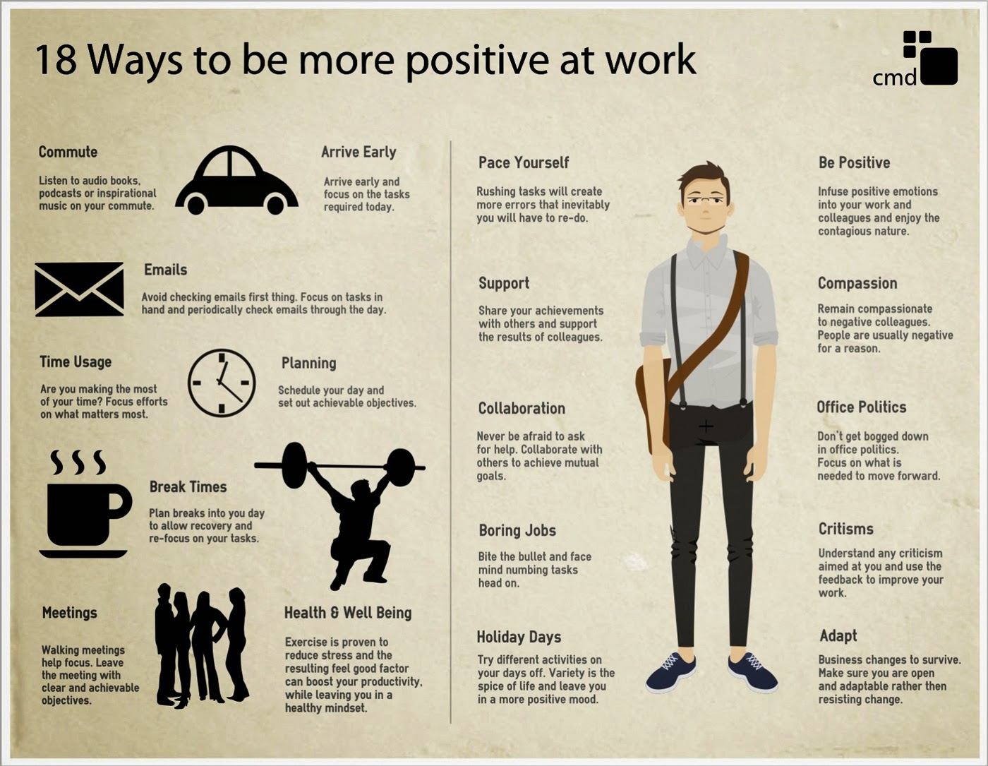
The purpose of this particular infographic, is to improve peoples attitudes at work - which will therefore improve the quality and quantity of their workflow.
Format:
The formatting is very simplistic. The text is easy to read, due to the font choice, and large size. The text is also arranged into small sentences or paragraphs, which isn't enough to put the reader off. Also, each section of text is labelled with a title to inform the audience on the topic, so if the reader is looking to find out about a particular subject, they can find the section quickly.
Content:
There is very little colour in infographic, which works well, as it doesn't distract from the text. Also the majority of the images being silhouettes is effective - as firstly it means the infographic isn't too busy, and also means the image of the man on the right of the sheet, is the main focus.
The reason for having such a large image of a man in the centre (and why it is drawn to us visually due to the colour) is so the readers can automatically see who it is aimed at: a satchel, black trousers, braces, a white shirt and glasses, automatically signals work.
Style:
The information is presented not as a chart or diagram, but in paragraphs. The reason for this, is because it is more like a guide, rather than a page of statistics, and it is easier to follow instructions through short chunks of text, than diagrams. Also, the reason they didn't just bullet point the information (which most guides do), is because they wanted to make it look more visually pleasing, and add photographs in between the writing, so the text doesn't look as intimidating and overbearing.
Layout:
The layout is spacious, and therefore not to overbearing to look at. The text is also separated with images related to it, which gives the readers an idea of what the text is about, and also helps direct them to what order they should read it in.
Target Audience:
Although this can apply to anyone with a job (including teenagers with part time jobs) I think the main target audience is
18 - 65.
I believe this, as I think this is aimed at full time workers (as it focuses on taking breaks and staying relaxed in the work environment - which leads me to assume its directed towards long hours of work). Any one bellow the age of 18, should be working part time, and most people past the age of 65, are retired.
It is also an image of a man, and not a student/child/elderly person, which also points out the target audience.
Regulatory bodies: (does it have to meet any standards or pass a classification? - film, web, advertising, copyright law)
It is copyrighted by CMD, which is where the information has come from. Although there are no statistics on the infographic, they must have had to do research/gather statistics to back up their list, before stating it as a solution to improving work.


