Sunday, 21 December 2014
Thursday, 20 November 2014
P4. Third Drafts Feedback
I then sent Pete my improved drafts, and he gave me some more things to tweak:
- (When I had done the above improvement) add more monitors to the editing image to make her look less like a sectary
- (When I had done the above improvement) add more monitors to the editing image to make her look less like a sectary
- Remove typo
- Change the name back to 'Job Roles in the Film Industry'
- Change the name back to 'Job Roles in the Film Industry'
P4. Second Drafts Feedback
Once I had made these changes I sent the infographics back to Pete for more feedback, he suggested I change the film reel to something more modern (suggested someone at a computer desk editing).
Wednesday, 19 November 2014
P4. Second Drafts
Tuesday, 18 November 2014
P4. Infographic Feedback
 After presenting my ideas and designs to the client Pete Fraser he informed me design 1 was his favourite, and asked me to produce a portrait version of it as well. He then went on to tell me how I could improve them:
- Change the title 'Careers in the Film Industry' to 'Job Roles in the Film Industry'
- Change all of the font to Europa (as this is the font used for the NFTS website)
- Take out less essential roles such as Head Greensperson
- Have three departments for each production process (pick the main job roles in the film industry)
- Have the images relating to each stage of production
Saturday, 15 November 2014
P3. Plan for the Production of Three Infographics and their Legal/Ethical Issues
These are the plans for the production of three infographics (I am using my three designs for this task, although making up a release date and budget needed for them - as these are factors I wont need to be concerned about - I will design my own logos and use free font).
Design 1:
Budget: £50
The £50 would be for the cost of the font used on the infographic, and also any royalty free imagery used on the design or paying someone to design the logos.
Production plan:
The production plan for all three infographics is to design the first draft, get feedback from graphic designers, the target audience, and the company/person who requested them, and take their feedback into account by improving the infographics until they are complete.
Timeline:
Rough/initial sketches - 17th November
Feedback - 25th November
First Draft - 30th November
Claiming any permission for royalty free images or font - 5th December
First Draft Feedback - 7th December
Improved Drafts - 15th December
Improved Drafts feedback - 20th December
Final Draft - 25th December
Infographic printed out as a poster and ready to be featured online - 27th December
Release date:
1st January 2015
Relevant legal and/ethical issues:
The images used to relate to the three production processes can't be taken off Google, and either need to be designed by myself/someone else, or a royalty free image. The images also need to contain a variety of ethnicities and genders so that its not offensive to anyone and appeals and welcomes everyone.
Design 2:
Budget: £30
To pay for the font on the infographic - there will be no royalty free images needed, as due to it being in the form of a clapperboard, other images would make the infographic too busy.
Production plan:
The production plan for all three infographics is to design the first draft, get feedback from graphic designers, the target audience, and the company/person who requested them, and take their feedback into account by improving the infographics until they are complete.
Timeline:
Rough/initial sketches - 17th November
Feedback - 23th November
First Draft - 27th November
First Draft Feedback - 30th December
Improved Drafts - 5th December
Improved Drafts feedback - 10th December
Final Draft - 15th December
Infographic printed out as a poster and ready to be featured online - 17th December
Release date:
20th December 2014 (The design is more minimalistic in comparison to the other two, and doesn't contain any images relating to the production processes - so therefore will quicker to produce and therefore released sooner)
Relevant legal and/ethical issues:
The clapperboard on the infographic will need to be designed by myself, due to any copyright regulations if I used someone else's.
Design 3:
Budget: £50
The budget will be identical to design 1, as the cinema screen contains a similar layout to this design, and therefore will use the same font and logos.
Production plan:
The production plan for all three infographics is to design the first draft, get feedback from graphic designers, the target audience, and the company/person who requested them, and take their feedback into account by improving the infographics until they are complete.
Timeline:
Rough/initial sketches - 17th November
Feedback - 22nd November
First Draft - 27th November
Claiming any permission for royalty free images or font - 5th December
First Draft Feedback -10th December
Improved Drafts - 15th December
Improved Drafts feedback - 20th December
Final Draft - 27th December
Infographic printed out as a poster and ready to be featured online - 3rd December
Release date:
8th January (This will take the longest as it involves the layout of design 1, as well as the information being displayed in the form of a cinema screen)
Relevant legal and/ethical issues:
The same copyright precautions must be taken as design 1, and also the logos will obey similar rules and have a range of ethnicities and genders. As this design is a cinema screen I have to come up with the design myself, and not take any imagery from Google.
The cost to turn the infographics into prints/posters:
Design 1:
Budget: £50
The £50 would be for the cost of the font used on the infographic, and also any royalty free imagery used on the design or paying someone to design the logos.
Production plan:
The production plan for all three infographics is to design the first draft, get feedback from graphic designers, the target audience, and the company/person who requested them, and take their feedback into account by improving the infographics until they are complete.
Timeline:
Rough/initial sketches - 17th November
Feedback - 25th November
First Draft - 30th November
Claiming any permission for royalty free images or font - 5th December
First Draft Feedback - 7th December
Improved Drafts - 15th December
Improved Drafts feedback - 20th December
Final Draft - 25th December
Infographic printed out as a poster and ready to be featured online - 27th December
Release date:
1st January 2015
Relevant legal and/ethical issues:
The images used to relate to the three production processes can't be taken off Google, and either need to be designed by myself/someone else, or a royalty free image. The images also need to contain a variety of ethnicities and genders so that its not offensive to anyone and appeals and welcomes everyone.
Design 2:
Budget: £30
To pay for the font on the infographic - there will be no royalty free images needed, as due to it being in the form of a clapperboard, other images would make the infographic too busy.
Production plan:
The production plan for all three infographics is to design the first draft, get feedback from graphic designers, the target audience, and the company/person who requested them, and take their feedback into account by improving the infographics until they are complete.
Timeline:
Rough/initial sketches - 17th November
Feedback - 23th November
First Draft - 27th November
First Draft Feedback - 30th December
Improved Drafts - 5th December
Improved Drafts feedback - 10th December
Final Draft - 15th December
Infographic printed out as a poster and ready to be featured online - 17th December
20th December 2014 (The design is more minimalistic in comparison to the other two, and doesn't contain any images relating to the production processes - so therefore will quicker to produce and therefore released sooner)
Relevant legal and/ethical issues:
The clapperboard on the infographic will need to be designed by myself, due to any copyright regulations if I used someone else's.
Design 3:
Budget: £50
The budget will be identical to design 1, as the cinema screen contains a similar layout to this design, and therefore will use the same font and logos.
Production plan:
The production plan for all three infographics is to design the first draft, get feedback from graphic designers, the target audience, and the company/person who requested them, and take their feedback into account by improving the infographics until they are complete.
Timeline:
Rough/initial sketches - 17th November
Feedback - 22nd November
First Draft - 27th November
Claiming any permission for royalty free images or font - 5th December
First Draft Feedback -10th December
Improved Drafts - 15th December
Improved Drafts feedback - 20th December
Final Draft - 27th December
Infographic printed out as a poster and ready to be featured online - 3rd December
Release date:
8th January (This will take the longest as it involves the layout of design 1, as well as the information being displayed in the form of a cinema screen)
Relevant legal and/ethical issues:
The same copyright precautions must be taken as design 1, and also the logos will obey similar rules and have a range of ethnicities and genders. As this design is a cinema screen I have to come up with the design myself, and not take any imagery from Google.
The cost to turn the infographics into prints/posters:
According to alocalprinter.com 20 A4 posters would cost approximately £20, and for 20 A3 posters approximately £25.
P3. Legal and Ethical Issues to Aviod
 Legal Issues:
For the imagery/photos featured in the infographic/print I will either:
- Need to come up with my own designs and draw out any logos/photos/templates myself to feature in the print
OR
- Get images of a royalty free website, or request permission to use somebody else's work
This is because the work is to be featured on a public website, and it is plagiarism if I claim somebody else's work is mine, or use somebody else's work without their consent.
 Ethical Issues:
I need to appeal to a wide audience when featuring people in the print/infographic, as anyone can go into the film industry however often white males tend to dominate the media regardless of this. I should also feature equal amounts of females as there are males, as well as a mixture of ethnicities so no one is offended and there are no ethical issues.
Tuesday, 11 November 2014
P2. Health and Safety for Graphic Designers
Here are some other health and safety issues I should look out for, which are aimed towards graphic designers, and towards people who work at desks:
Posture - having a bad posture can cause back pains, muscle pains, headaches, loss of sight, and sickness (sit up right in a supportive chair)
Fatigue - not getting enough sleep and going to bed late can cause fatigue (get enough sleep, and change location/environment to somewhere less dark and warm)
Computer Eye Strain - sitting in front of a computer for too long and staring at a screen can cause eye strain, head aches, migraines, dry eyes, double vision and blurriness (work in a properly lit workspace, blink lots, take breaks every half an hour or so away from your screen)
Manual tasks - overexertion or repetitive movement can cause muscular strain (avoid this)
Gravity - falling objects, falls, slips and trips of people can cause fractures, bruises, dislocaions, concussion, permanent injuries or death. (observe your surroundings)
Electricity - electrical wires can cause shock, burns or death from electrocution (don't touch random loose wires, and keep an eye on where they are)
Monday, 10 November 2014
P2. Recce Report and Health and Safety Issues
 Location 1: Home
Address: Telegraph Street, Cottenham, Cambridge CB24 8QU
Description: Most of the infographics/posters will be produced at home on my computer.
Issues:
Working from home may be more efficient as there are less people around to distract me, however there are other things that could draw away my attention (such as TV, Facebook, Ipad etc...)
Health and Safety Issues:
Problem 1: I could damage my eyes by looking at the screen for a long duration of time (whereas in college we would be given breaks/lessons would only be 1.5 hours). I could also give myself a headache from this.
Solution: Monitor the time spent at my computer desk more carefully, make sure I assign myself breaks and maybe set an alarm to remind me. Drink lots of water to prevent headaches (but not near computer)
Problem 2: Unlike at college, I consume food at my computer desk which could get into my keyboard/computer and cause damage (especially liquids such as soup).
Solution: First of all there is the option to not eat at my desk at all, in case any damage is caused and delays my work. If I do get hungry eat away from my desk or eat large solid food that wont spill/produce crumbs.
Problem 3: As I am working from home, I am using my own computer (meaning I will have the freedom to download things that are irrelevant to the work). This gives me the risk of catching viruses which could corrupt my work and possibly break/slow down my computer.
Solution: Make sure I have an anti virus that is always updated/active, and be extra careful when downloading from unknown sites (only download things from http addresses).
Problem 4: Again, due the comforts of my own home and an unsupportive chair I tend to slouch and sit in unhealthy positions when at my computer desk, which could cause damage to my spine inflicting back pain.
Solution: Instead of using a comfortable chair, I should swap it for a supportive one. I should also monitor how I sit and make sure its not doing any damage.
 Location 2: Long Road Sixth Form College
Address: Long Road, Cambridge CB2 8PX
Description: Although I will mainly be producing my prints/infographics at home, I will also be sending them to my college laptop to get feedback from peers and teachers, and tweaking them there and then on the Photoshop files.
Issues:
There are friends that I might chat to which will draw my attention away from my work. Also there might be other assignments/unit work that needs doing first, and therefore this project wont be main priority. Therefore working from home is the better option.
Health and safety issues:
Problem 1: Although in college we're not aloud to bring food to class, we are aloud to bring water. If any water spilled on the laptop, it could damage or possibly break it - putting the work at risk.
Solution: Go outside to drink water, Keep lid tightly screwed on when the waters inside, and don't have it sitting on the desk.
Problem 2: As the laptops are shared with other students, someone could accidentally delete the work.
Solution: Save back ups onto another hard drive/memory stick just in case something does get deleted - also have the copies at home.
Problem 3: As there is a class of us, I will be surrounded by people - some of which could have a contagious illness/cold. If I catch something it could slow down my work flow or cause me to take days of college.
Solution: Keep my immune system strong (take plenty of vitamin C and eat enough) as well as avoid close contact with anyone with a cold.
Problem 4: As the class room is busy and full of equipment/objects, there is the risk of tripping over something on the ground and causing damage to oneself.
Solution: Watch my step/where I am going, and pick up anything that has fallen onto the ground or move any wires that get in the way.
P1. Roles in Film
Here is my first rough digital layout of one of my infographic/print design. I plan to research the key roles in film in the three stages (pre-production, production, and post-production) and add them to the
design.
 Pre-production
Story Development
Screenwriter
Story Editor
Researcher
Producers
Executive Producer
Producer
Co-producer
Directors
Director
1st Assistant Director
Script Supervisor
Casting Director
Production
Art Department
Production Designer
Art Director
Set Designer
Storyboard Artist
Set Decoration/Props
Set Decoration
Prop Master
Set Buyer
Heads Greensperson
Construction Co-ordinator
Paint Co-ordinator
Makeup/Hair & Costume
Costume Designer
Key Makeup Artist
Key Hair Stylist
Costume Co-ordinator
Camera & Lighting
Cinematography
Camera Operator
Clapper Loader
Gaffer
Best Boy
Key Grip
Production Sound
Sound Designer
Sound Mixer
Special Effects
Boom Operator
Special Effects
SFX Supervisor
Key Special Effects
Model Maker
Post-production
Picture Editing
Supervising Editor
Editor
Titles Designer
Sound
Supervising Editor
Sound Effects Editor
Music Supervisor
Composer
Music Editor
Foley Artist
Post-production
Post-production Supervisor
Post-production Co-ordinator
Post-production
Visual Effects
VFX Supervisor
Technical Director
Lighting Director
Visual Effects Artist
Lighting Artist
Animator
design.
 Pre-production
Story Development
Screenwriter
Story Editor
Researcher
Producers
Executive Producer
Producer
Co-producer
Directors
Director
1st Assistant Director
Script Supervisor
Casting Director
Production
Art Department
Production Designer
Art Director
Set Designer
Storyboard Artist
Set Decoration/Props
Set Decoration
Prop Master
Set Buyer
Heads Greensperson
Construction Co-ordinator
Paint Co-ordinator
Makeup/Hair & Costume
Costume Designer
Key Makeup Artist
Key Hair Stylist
Costume Co-ordinator
Camera & Lighting
Cinematography
Camera Operator
Clapper Loader
Gaffer
Best Boy
Key Grip
Production Sound
Sound Designer
Sound Mixer
Special Effects
Boom Operator
Special Effects
SFX Supervisor
Key Special Effects
Model Maker
Post-production
Picture Editing
Supervising Editor
Editor
Titles Designer
Sound
Supervising Editor
Sound Effects Editor
Music Supervisor
Composer
Music Editor
Foley Artist
Post-production
Post-production Supervisor
Post-production Co-ordinator
Post-production
Visual Effects
VFX Supervisor
Technical Director
Lighting Director
Visual Effects Artist
Lighting Artist
Animator
Sunday, 9 November 2014
P1. Target Audience Feedback
Considering the target audience for the infographics include students my age, I asked some of my peers what they thought to the designs:
Feedback:
Idea 1:
- They liked the idea of using the NFTS patterns and colour scheme
- They also suggested some of the images that could be related to the three production stages:
Pre-production: a storyboard, someone writing a script
Production: a camera, a directors chair, a small set
Post-production: a film reel, a screen
Idea 2:
- They suggested the clapperboard should be closed, else having it too open will mean shrinking the board and therefore writing would be harder to read
- They suggested having a colourful background, or text to catch peoples attention (black and white alone may be too dull)
- They liked the idea of using white text to replace the white lines on the clapperboard top
Idea 3:
- They said they liked the idea of having the information in the screen, although it might be too squished and hard to read
- The chairs in the screen may be to distracting from the information, and the detail may make the infographic too busy
- Again, more colour may be needed to catch peoples attention
P1. Infographic Ideas
 Idea 1
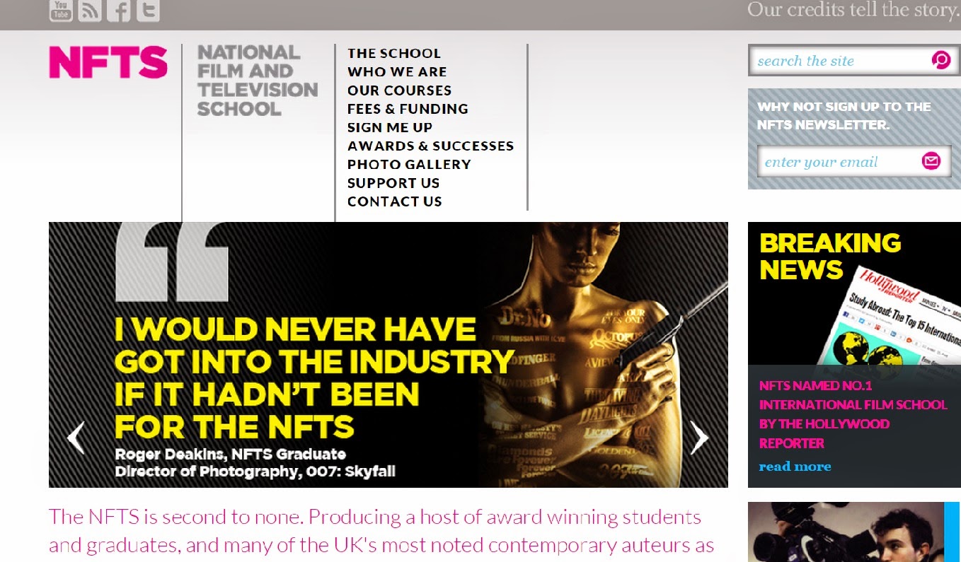
I plan to make a landscape infographic/print following the colour schemes and patterns from the NFTS web page. The page mainly features greys, pink, yellow and black. It also often features grey and black stripes, which I plan to bring into my infographic for more texture.
I plan to have a black and grey stripped banner at the top of the page, with the title 'Careers in the Film Industry' in pink. At the bottom of the page, there will be an identical banner with pink text, although this will be the NFTS logo.
The background will be the light grey, and in-between the banners, there will be the lists of available film roles in the industry, arranged into sections:
Pre-production
Production
Post-production
As this infographic is aimed at youth and young adults, I will add a film related image to each section. This image will be black and white, as colour will distract too much from the writing, and also ruin the NFTS colour scheme.

Idea 2
For this design, I again plan to stick to the NFTS colour scheme and patterns, but the presentation will be completely different.
I plan to have all of the information on a clapperboard I will design. The title will be at the top on the top, and will be white font on a black background (to fill in for the black and white stripes), and the roles will be in the main rectangle. I plan to use the white chalk lines to separate the three production processes, so they are easier to distinguish between. Underneath the clapperboard, there will be grey and black stripes to bring texture to the image, and the pink NFTS logo will be placed on the clapperboard to bring colour to the infographic.
I think this will be very relevant to young aspiring filmmakers, as many of them will have seen/will know what a clapper board is, and will link this to film - therefore will be more likely to catch their attention.
Idea 3
Yet again I plan to follow the NFTS colour scheme.
For this infographic, I plan to present all of the information via a cinema screen. I will have a similar lay out to my first inforgraphic inside the screen, with the title and roles presented. There will be chairs captured in the infographic, but they will be very simplistic with very little detail, so the viewer wont be distracted from the screen. The NFTS logo will be in pink, and positioned against the black chairs in the bottom right.
Similar to idea 2, this will be more likely to draw in young aspiring filmmakers, as they will see the design of the cinema screen, and link it to film.
Saturday, 8 November 2014
P1. Film Industry Related Infographic
 Purpose:
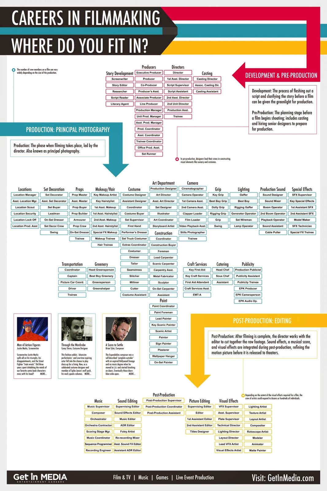
To inform people on all of the roles film production has to offer, and what stage of production they come under.
Format:
The font is simple, which works well - as it is easy to understand. Although, in places (such as the lists of roles in the industry), the font is very small, which can make it extremely difficult to read.
The title is a large, bold, and in capital letters, which helps it stand out in comparison to the smaller text.
Content:
I find the arrows very effective, as the readers can quickly find the production stage of film they are looking for. The arrows also add pattern and colour to the infograpic, making it appear more visually appealing and eye catching.
There are also images used, in relation to the text. These are used to remind the readers of the film, and also add visual interest.
Style:
The information is presented in lists, this is useful, as it is a fast and easy way to process all of the job roles in film. They are also categorised into the departments of film, which makes it easier to find a specific role.
The styles simplicity also links to the target audience, as as more mature teenagers/young adults are going to be drawn to this, rather than young kids who are drawn to lots of bright, colourful photos.
Layout:
The layout contributes to the infographic being clear and easy to understand. The reason for this, is because although it contains many words structured tightly together in groups, there is a lot of space in between the groups. This helps the reader categorise the information into each stage of production.
Because there are so many roles in film listed, it does feel a bit crammed, and if printed on A4 paper, would be difficult to read. But an easy solution to this is the high resolution which enables readers to zoom in on the web, or printing it as a poster in a larger size (A3 maybe?).
Target Audience:
I would assume students aged 13 - 25 are the target audience for this infographic.
This is my estimate, as people older than 25 who are planning on entering the industry, have probably already left education and done their research about what roles they want to pursue. Also most students under the age of 13, are still growing and focusing on numerous amounts of subjects, and are unlikely to be thinking about the roles in film.
Regulatory bodies: (does it have to meet any standards or pass and classification? - film, web, advertising, copyright law)
Unsure
Sketch of the infographic:
Friday, 7 November 2014
P1. Infographic Annotation
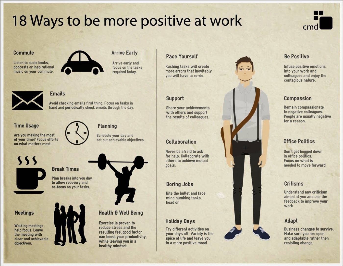 Purpose:
The purpose of this particular infographic, is to improve peoples attitudes at work - which will therefore improve the quality and quantity of their workflow.
Format:
The formatting is very simplistic. The text is easy to read, due to the font choice, and large size. The text is also arranged into small sentences or paragraphs, which isn't enough to put the reader off. Also, each section of text is labelled with a title to inform the audience on the topic, so if the reader is looking to find out about a particular subject, they can find the section quickly.
Content:
There is very little colour in infographic, which works well, as it doesn't distract from the text. Also the majority of the images being silhouettes is effective - as firstly it means the infographic isn't too busy, and also means the image of the man on the right of the sheet, is the main focus.
The reason for having such a large image of a man in the centre (and why it is drawn to us visually due to the colour) is so the readers can automatically see who it is aimed at: a satchel, black trousers, braces, a white shirt and glasses, automatically signals work.
Style:
The information is presented not as a chart or diagram, but in paragraphs. The reason for this, is because it is more like a guide, rather than a page of statistics, and it is easier to follow instructions through short chunks of text, than diagrams. Also, the reason they didn't just bullet point the information (which most guides do), is because they wanted to make it look more visually pleasing, and add photographs in between the writing, so the text doesn't look as intimidating and overbearing.
Layout:
The layout is spacious, and therefore not to overbearing to look at. The text is also separated with images related to it, which gives the readers an idea of what the text is about, and also helps direct them to what order they should read it in.
Target Audience:
Although this can apply to anyone with a job (including teenagers with part time jobs) I think the main target audience is 18 - 65.
I believe this, as I think this is aimed at full time workers (as it focuses on taking breaks and staying relaxed in the work environment - which leads me to assume its directed towards long hours of work). Any one bellow the age of 18, should be working part time, and most people past the age of 65, are retired.
It is also an image of a man, and not a student/child/elderly person, which also points out the target audience.
Regulatory bodies: (does it have to meet any standards or pass a classification? - film, web, advertising, copyright law)
It is copyrighted by CMD, which is where the information has come from. Although there are no statistics on the infographic, they must have had to do research/gather statistics to back up their list, before stating it as a solution to improving work.
P1. What is an Infographic?
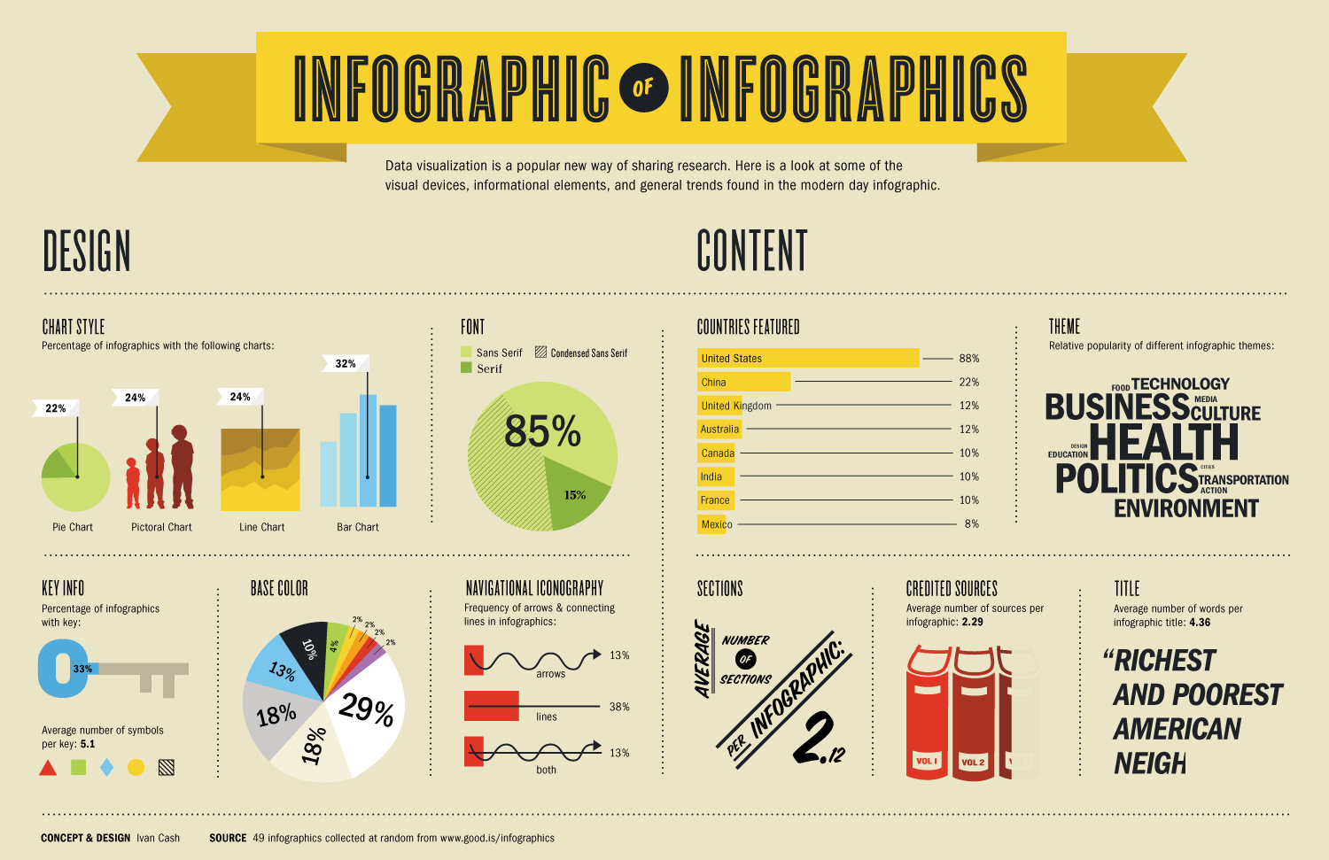 An infographic, is a visual representation of data, knowledge, or information, which can come in the form of a chart or diagram.
The purpose of an infographic, is to not only present information, but to present it as quickly and clearly as possible.
The process of designing an infographic, can be known as information architecture, information design, and data visualization.
According to Edward Tufte, info-graphical displays should follow these set of rules:
- show the data
- induce the viewer to think about the substance rather than about methodology, graphic design, the technology of graphic production or something else
- avoid distorting what the data have to say
- present many numbers in a small space
- make large data sets coherent
- encourage the eye to compare different pieces of data
- reveal the data at several levels of detail, from a broad overview to the fine structure.
- serve a reasonably clear purpose: description, exploration, tabulation or decoration.
- be closely integrated with the statistical and verbal descriptions of a data set.
Infographics can be produced traditionally, using everyday resources such as graph paper, pencils, markers and rulers. Although, more recently (in the digital age) they are being made with the use of computer software, such as Adobe Illustrator.
They can be printed out as posters, or digitally displayed online.
They can be printed out as posters, or digitally displayed online.
Thursday, 6 November 2014
Introduction to the Project
The aim of this project is to produce an infographic design to be featured online, and a print based poster for a free online six week course called 'Exploring Film-Making'.
The print and infographics purpose will be to inform young filmmakers on all of the roles available in the film industry, and therefore should be clear and easy to understand, and something that is rememberable and aesthetically pleasing to look at.
This course is run by the National Film and Television School, the British Film Institute and FutureLearn, so therefore should reflect the NFTS colour scheme and brand, and include the logos from all three institutes.
For this project, I will be researching and learning about the purpose of infographics, the roles available in film, and then bringing this research into my own prints/infographic designs.
Subscribe to:
Comments (Atom)


