I decided to use Adobe Photoshop to produce my infographic/poster. Although Adobe Illustrator is better for posters due to its ability to create vector images (meaning its great for posters as you can print it any scale) I chose to use Photoshop as I know the software a lot better.
The majority of my work was done by using the brush and line tools, and using l
ayers to place shapes over one another when experimenting with the design.

I then added font and played around with the colours to see what fitted best with the design, but also reflected the NFTS style. I also added very subtle stripes to a layer overlapping the black banners - mimicking the patterns also featured on the NFTS site as well as adding pattern to the infographic/print.

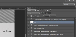
I named each layer so that I could easily find everything, and also adjusted the settings of some of the layers - such as decreasing the opacity of the projector ray to make it appear more like a light, but also to add tone to the design by the use of overlapping.
Then using the font tool, I began writing out the roles in the film industry, however it looked a bit busy and wild,so I separated the categories with the line tool.
Lastly, I made sure I didn't merge any layers, or flatten any text layers - this is because that way I can keep the Photoshop file as a template, for when Pete wanted me to change the writing/text, logos or imagery.
I also experimented a lot with the images featured on the print/infographic. This was partially due to Pete's feed back about the reel not relating to the film production stage, but also linked to composition:
 I then added font and played around with the colours to see what fitted best with the design, but also reflected the NFTS style. I also added very subtle stripes to a layer overlapping the black banners - mimicking the patterns also featured on the NFTS site as well as adding pattern to the infographic/print.
 I named each layer so that I could easily find everything, and also adjusted the settings of some of the layers - such as decreasing the opacity of the projector ray to make it appear more like a light, but also to add tone to the design by the use of overlapping.